
The grants database is the cornerstone of many charitable foundations’ websites. Typically one of the most viewed areas of the site, its users tend to be some of the most motivated and engaged site visitors. So when the Ford Foundation asked us to redesign their grants database as part of an ongoing effort to improve accessibility on their website, we were thrilled to take on the challenge.
We began by conducting a user experience audit of other foundations’ grants databases to understand common design patterns, shared terminology, and emerging trends. This process informed our subsequent discovery sessions with internal stakeholders from across the organization (legal, IT, program staff, grants management, etc.).
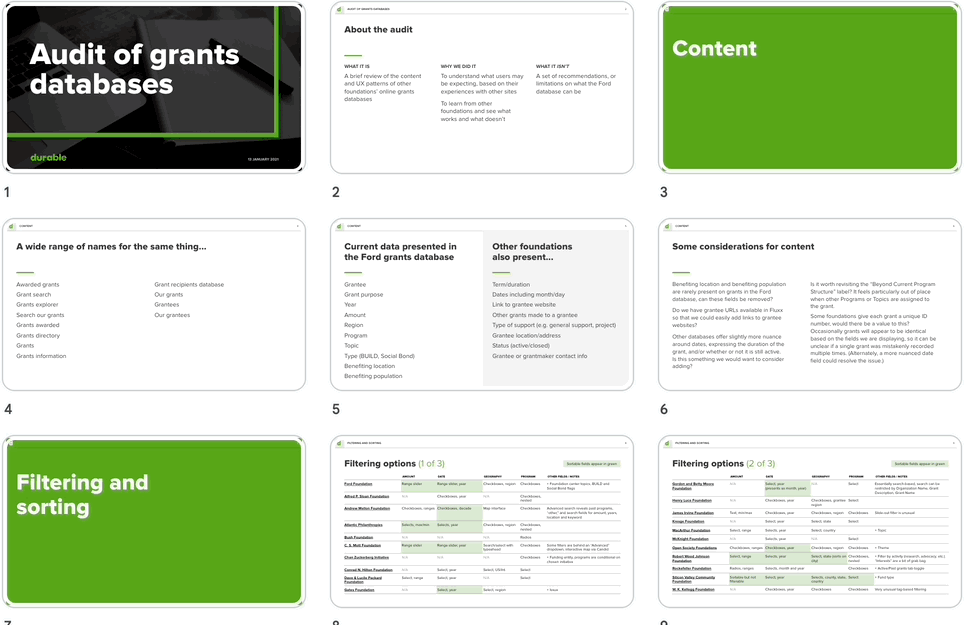
Our design audit explored how other grants databases handled search, filtering, taxonomies, and more.
For example, if we noticed that a specific data field was commonly seen on other websites but not present in the current Ford database, we could discuss whether it might make sense to add it. A variety of factors could influence the decision making process: Has this data historically been collected in a consistent way? Is it meaningful in the context of Ford’s grantmaking? Does publishing it online introduce risks to the safety of international grantees? As the vision for the new grants database took shape, we created interactive wireframes to document the information architecture and demonstrate the proposed filtering behaviors.
The new grants database we created was fully accessible and simpler to use—while providing richer content. Content editors were also provided with tools to connect the grants database with other content on the site, helping highly-engaged database visitors discover related content such as blog posts or videos.
Design highlights
A broader view of grantmaking
In the research phase, we identified an unmet need for higher-level context around the foundation’s grantmaking. Certain audiences, like potential employees or journalists, expressed a preference for summarized data—such as overall annual funding, average grant size, or funding categorized by program area—over delving into the specifics of individual grants. Furthermore, stakeholder interviews revealed that some grantmaking information was manually compiled outside of Fluxx (their internal grants management system). This resulted in some crucial aspects of Ford’s work being undiscoverable solely through the database.
To address these issues, we created a landing page that allowed users to quickly begin a search of the grants database, or scroll further to see summarized grant statistics in an easy-to-digest infographic style. The page also included a chart which showed grantmaking by program both internationally and in the United States.
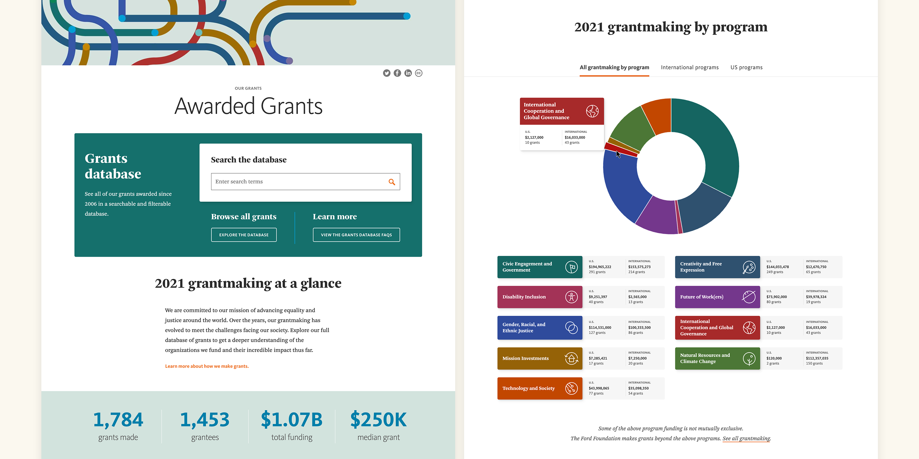
The Awarded Grants page was added to provide summary data for visitors more interested in high-level trends than specific grants.
Improved filtering and search
For the new database, we moved the filter buttons from the results table’s column headings to a separate column on the left. In addition to being more intuitive for users, it also eliminated the need for each filter to have a corresponding table column. We then reduced the total number of columns in the results table, significantly enhancing usability on tablets and smaller desktop screens. This approach also allowed for more descriptive, understandable labels that wouldn’t have fit in the narrow columns of the previous design (e.g. “Funding office” instead of “Region”).
When clicked, each filter button opened an overlay panel with either fields for numeric entry or checkboxes. For filters where hundreds of options may be available to select, such as “Grantee” and “Benefiting Location,” a predictive search field at the top of the panel filtered the selectable options immediately as users typed in the field.
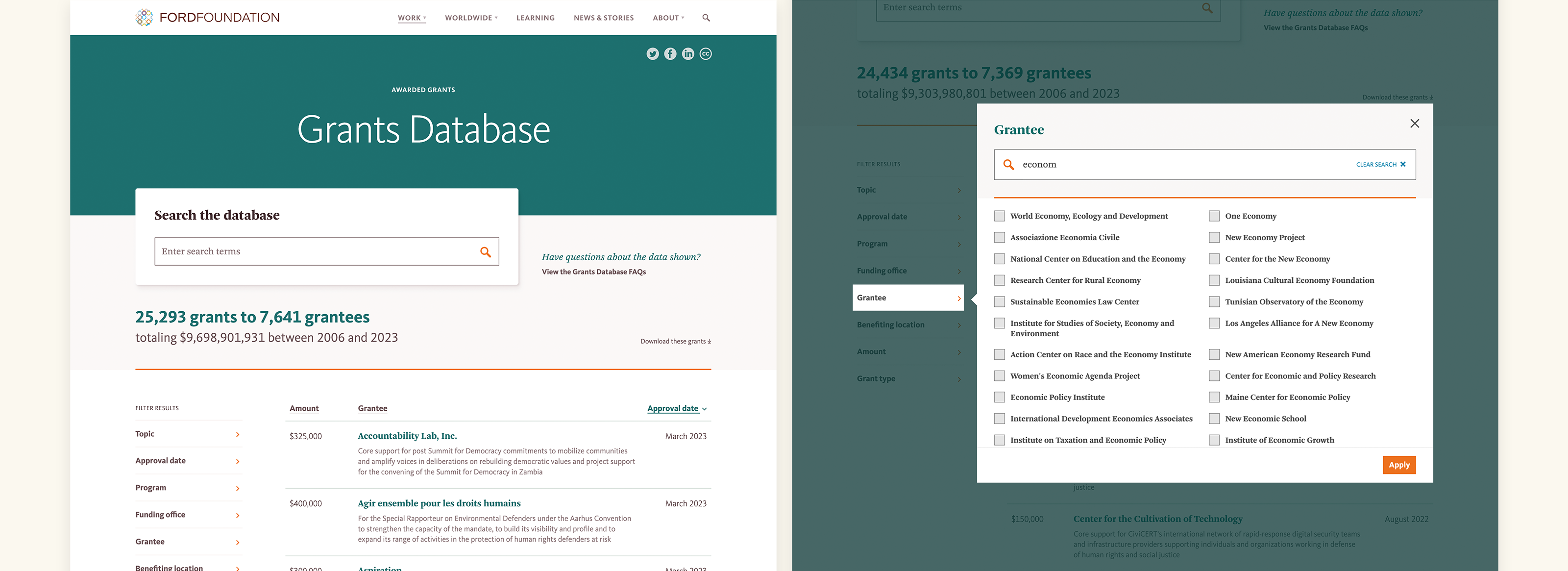
The updated filtering interface allowed users to either quickly locate a specific term, or browse all available options.
With the prior design, users reported being unaware that filters were applied, which created frustration when the results were not what they expected. To provide additional visibility, we added filter “chips” above the grant results as the user applied filters.
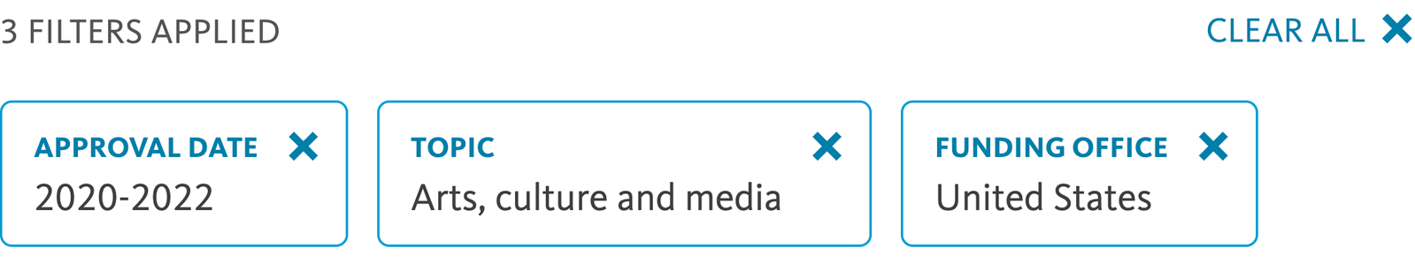
Clicking a “chip” above the grants list easily removed the filter and refreshed the results.
Linkable grant and grantee detail pages
Previously, clicking on a grant result expanded the row to reveal additional information about the grant. This worked reasonably well for sighted users, but posed challenges for users navigating the page with a screen reader since it deviated from standard table behavior. The amount of additional content that could be reasonably presented for any given grant was also limited.
With the redesign, we created dedicated pages for each grant and grantee, which were automatically generated from the content in the database. Since each grant and grantee then had a unique URL, they then became searchable outside of the database interface.
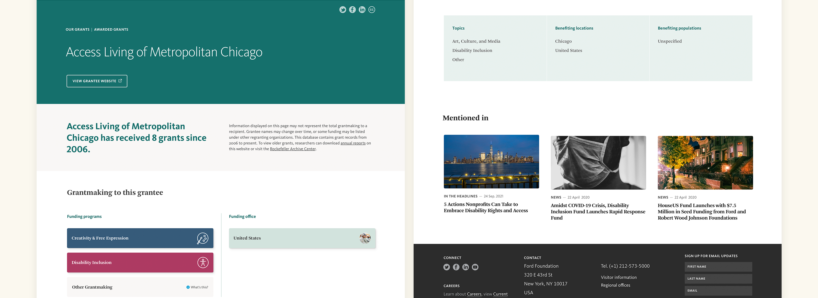
The “Mentioned in” row shown above automatically displays pages where the grant or grantee was referenced in other site content.
This approach also opened up a powerful opportunity for Ford’s communications team to connect content across the site that had previously been siloed. We developed components that could be added to any page to present links to grant or grantee detail pages in a consistent style. Consequently, grant and grantee pages would automatically display cards linking to any pages where they were referenced on the site. The popularity of the grants database could then be leveraged by exposing visitors initially interested in the database to additional narrative content and insights into the grantmaking strategy.